FORTBAY
Fortbay is a bay area development company. They approached us with the task to create a simple but lasting logo concept that can be timeless and tell a unique story. That meant a typical Golden Gate Bridge concept was out. The name was to represent the forts and history of the San Francisco Bay. Something architectural and strong. Black and white was the color palette given to us by the client.
The first step to begin a project like this is to do research and get familiar with the topic. After the research comes the sketching and tinkering phase. The contract we had in place was for 4 initial concepts. The concept that resinated most with the client was the Fort Point Light House. It had all the elements the client was looking for but needed some more work.


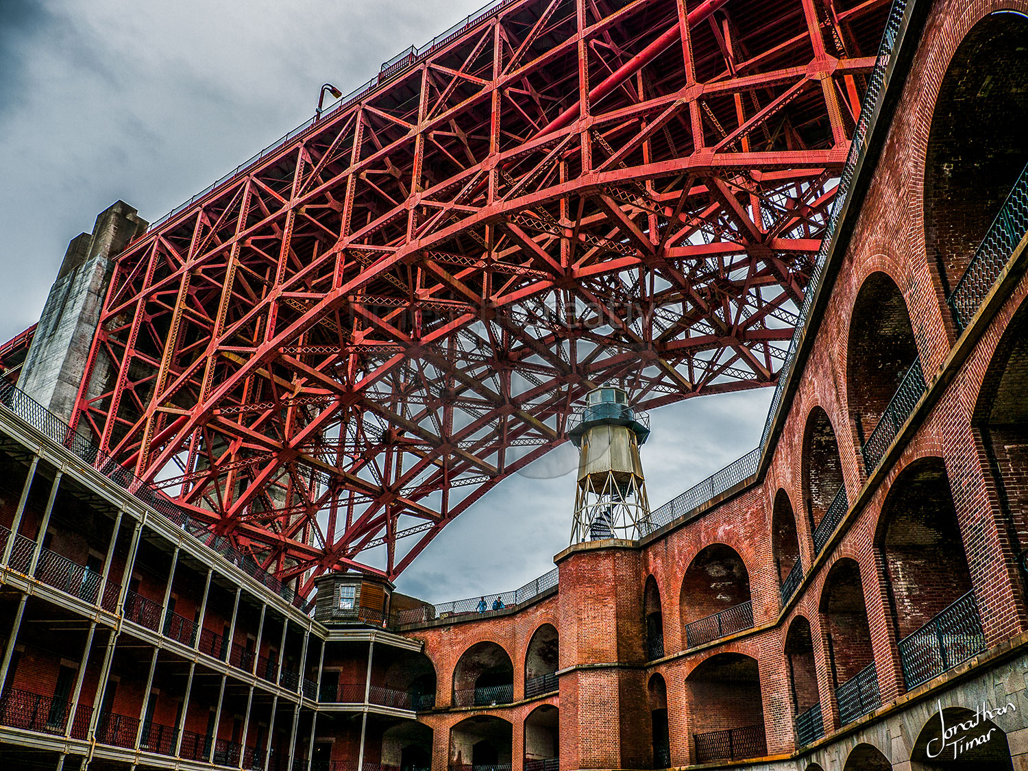

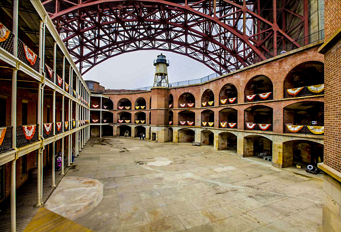
Once the direction is selected we begin to dig deeper into different angles and layouts. We really wanted to incorporate the under side of the Golden Gate Bridge, something that isn't seen very often. Then we play with different layouts and crops for the light house and renderings of the bridge. Below are the next 4 revision concepts we presented.

After one last round of feedback and revisions, we did some font exploration and landed of the final logo. Below you will see all logo treatments as well as the stationary presentation.